By Isabel Nias, CPOM Research Associate, University of Bristol
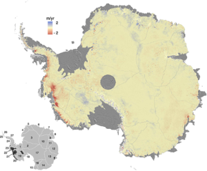
Over the course of my PhD I must have said or written the name “Amundsen Sea Embayment”, or “ASE” for short, thousands of times. But why is this region of the West Antarctic Ice Sheet worth studying at all? The short answer: its ice streams are some of most rapidly thinning in Antarctica, and are currently contributing the most towards sea level rise – just look at any map of observed Antarctic thinning rates and the ASE stands out with the most intense colours.
Fig. 1) Antarctic surface elevation change
As a glaciologist and ice sheet modeller I am particularly interested in why this is the case. What processes are going on there? There are a number of fast flowing ice streams in this region, including the heavily studied Pine Island and Thwaites glaciers as well as a number of smaller ones, such as Smith Glacier. These ice streams are all grounded on bedrock that is below sea level and generally deepens inland. Therefore the ASE is a prime candidate for potential runaway retreat of the grounding line (where the ice sheet starts to float), known as marine ice sheet instability (see Box 13.2 of the IPCC AR5 WG1 report).
It is apparent that understanding this area is critical to producing better estimates for future sea level rise. But what can ice sheet modelling specifically bring to the table? I think we can use models to help answer questions about ice dynamics and why the ice sheet appears to be behaving the way it is. On top of this, models can be used to make predictions of how the ice sheet may respond in the future. In my work I have used BISICLES, an ice flow model developed by Steph Cornford here in Bristol and Dan Martin at Berkeley Lab in the USA, to simulate the ASE’s evolution over the coming decades more than 250 times, each time with different values for various parameters, including basal traction, ice viscosity and ice shelf melt rate.
But what does this tell us? How can we possibly know which configuration of parameters is correct? The answer is we can’t. Models are simplifications of reality and even the most physically based ones rely on parameters for processes that are unknown or can’t be resolved by the model. It is possible to tune the parameters to reproduce the current flow pattern of the ice sheet, without these parameters being within the realistic range of values. For example, there could be a lot of friction at the bed of the ice sheet, but as long as the ice has low enough viscosity, the observed sea level contributions could be matched. This doesn’t necessarily tell you anything about the processes involved or which parameters are correct.
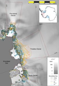
However, this doesn’t mean the results aren’t useful. For example, we found that grounding line retreat of Pine Island and Smith glaciers is sensitive to the melt rate under the ice shelf, whereas Thwaites, with its laterally unconstrained ice shelf, is less so. The work also shows that good observations of the ice thickness and bed topography are vital to modelling the grounding line dynamics. Small ridges in the topography, not necessarily resolved by current bed products (e.g. BEDMAP2), can result in a slowdown of retreat.
Fig. 2) Grounding line retreat in the ASE; each line represents the grounding line position after 50 years of an individual simulation (from Nias et al., 2016).
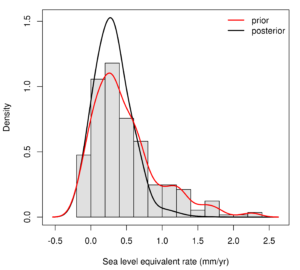
What is more, we can use additional observations to constrain the distribution of sea level contributions produced by the various simulations. To do this, we used observations of current thinning rates from CPOM’s Noel Gourmelen in Edinburgh to compare with the modelled thinning rates produced by each parameter configuration. Using Bayes’ rule, I assigned a score to each simulation, which represents the likelihood of that simulation being true, given the observations. This technique is common place in climate and hydrological modelling, but currently less so in ice sheet modelling. In Figure 3 the red line is the prior distribution of sea level rise rate produced by the ensemble of simulations, and the grey line is the posterior distribution recalculated using the likelihood scores. You can see that the posterior line has sharpened the peak – i.e. the observations have constrained the distribution of potential range of sea level rise. Note that the peak has not shifted, with the maximum likelihood remaining around 0.25 mm/yr sea level rise. The centre of the parameter range is tuned to velocity observations, so that tends to imply that two independent methods of estimating mass loss – computing the discharge from the flow and thickness fields, and observing changes in surface elevation – agree.
Fig. 3) Histogram of sea level contribution (50 year mean rate) from the ensemble of ASE simulations, with smoothed prior distribution (red line) and updated posterior distribution (black line).
I have used this updated distribution to discard the most extreme simulations, before extending the remaining simulations further into the future. I hope that these simulations will provide a better projection of sea level contributions from the Amundsen Sea Embayment.


